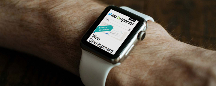
Websites on the Apple Watch
Thursday 19th March 2015 at 2:36pm by Bradley D
With the recent release of innovative new devices like the Apple Watch and the Samsung Galaxy S6 Edge the boundaries of web browsing are being pushed to the limit, but luckily responsive design has come to the rescue!
Some websites have a dedicated fixed width mobile website on a subdomain just like m.facebook.com, others opt for the benefits of a website that can change and respond to the width of the device it is being viewed on, aka "responsive" design. Both have their advantages and disadvantages but responsive design always comes out on top.
We develop our websites with a responsive framework as standard, here’s a list of reasons why:
- we don’t have to maintain multiple separate code bases;
- responsive design adapts to the device it’s on rather than trying to find a fixed width that may or may not fit all devices;
- it doesn’t matter how many new devices are released, responsive websites adapt to fit the device;
- you get a website that is mobile, tablet, and desktop friendly;
- visitors get exactly the same experience on all devices regardless of whether they are be touching or clicking the website;
- responsive design isn’t difficult to integrate, we use the popular Bootstrap framework from Twitter used by tens of thousands of sites worldwide;
- you don’t have to perform an intricate dance with your fingers just to click a link, all the information is in front of you without the need to zoom in and out or left and right.
Google loves responsive design because everything is on one URL, making it much easier for them to crawl. Google also takes in to account how your website looks on a mobile device so if you have a website that fits on any device they’ll give you a better SEO score.
So if you’re planning on getting a new website developed, ask your web developer whether they’re able to offer you a responsive website. The best thing is, it’s not much extra work to integrate so they shouldn’t have any issue helping you out!
Comments
More News
Monday 29th June 2015 - We are pleased to announce the new Harbron Recruit website is now live! Harbron Recruit got in touch with us recently, as they wanted their Wordpress site moving to a bespoke platform and also wanted to extend their site with custom functionality.
Tuesday 28th April 2015 - Just as your screens and internet connections leap into the future, so should your website!
Thursday 23rd April 2015 - Google has now released it’s new mobile search algorithm and has released a handy tool to help you check your website.
Wednesday 15th April 2015 - Sometimes you find that your web browser just doesn’t have that certain feature that you want. Extensions and plugins have come to the rescue, but are the extensions or plugins you have installing from a trusted source?
Friday 10th April 2015 - Quite often when we need to write a large amount of code to complete a particular task we’ll first look to see if someone has already written an open source library which we can use instead of spending hours or days writing something that will do that same thing.