Google releases mobile friendly test tool
Thursday 23rd April 2015 at 9:39am by Bradley D
As most of you will know Google has now released it’s new search algorithm which is set to favour mobile friendly sites in it’s search results. All of our websites are built using the Twitter Bootstrap responsive framework but if you think your website may not be mobile ready then Google has released a handy tool to help you check.
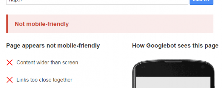
Titled “Mobile-Friendly Check” this new tool allows you to analyse your (or your competitors) website to discover whether it’s what Google deems “mobile-friendly”. If it is you’ll get a nice green banner saying "Awesome! This page is mobile-friendly.” but if it isn’t mobile friendly Google will give you some reasons why it failed and offer some advice on how you can improve.
Comments
More News
Monday 29th June 2015 - We are pleased to announce the new Harbron Recruit website is now live! Harbron Recruit got in touch with us recently, as they wanted their Wordpress site moving to a bespoke platform and also wanted to extend their site with custom functionality.
Tuesday 28th April 2015 - Just as your screens and internet connections leap into the future, so should your website!
Wednesday 15th April 2015 - Sometimes you find that your web browser just doesn’t have that certain feature that you want. Extensions and plugins have come to the rescue, but are the extensions or plugins you have installing from a trusted source?
Friday 10th April 2015 - Quite often when we need to write a large amount of code to complete a particular task we’ll first look to see if someone has already written an open source library which we can use instead of spending hours or days writing something that will do that same thing.
Friday 27th March 2015 - Over the past 24 hours GitHub has been suffering from a DDOS attack which has been evolving in order to circumvent the preventative measures GitHub has introduced.